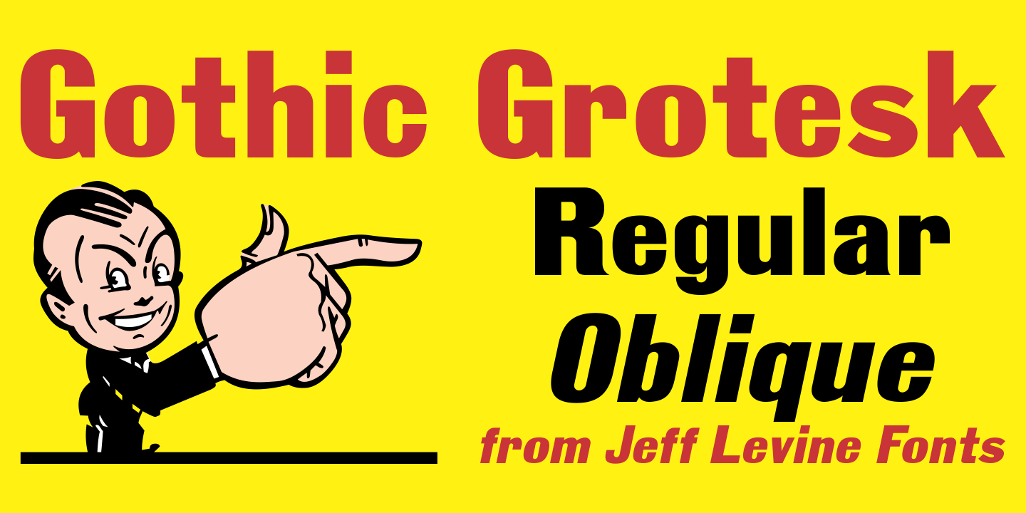
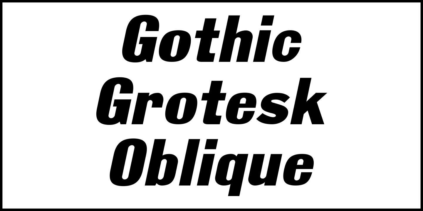
Gothic Grotesk
From $55 | 2 Font Family by Jeff Levine Fonts
In a specimen book from Stevens, Shanks & Sons, Ltd. of London (circa1930s) “Royal Gothic” was their version of a classic grotesk sans that had been in use as far back as 1899 when the Keystone Foundry called it “Charter Oak”.
The terms "gothic" and "grotesk" were equally applied to early sans serif typefaces – at first not well embraced by printers as being too ugly (grotesque) for use.
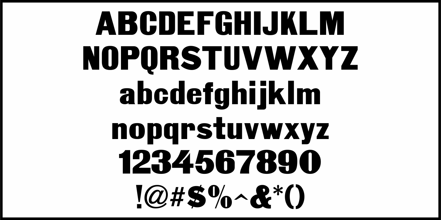
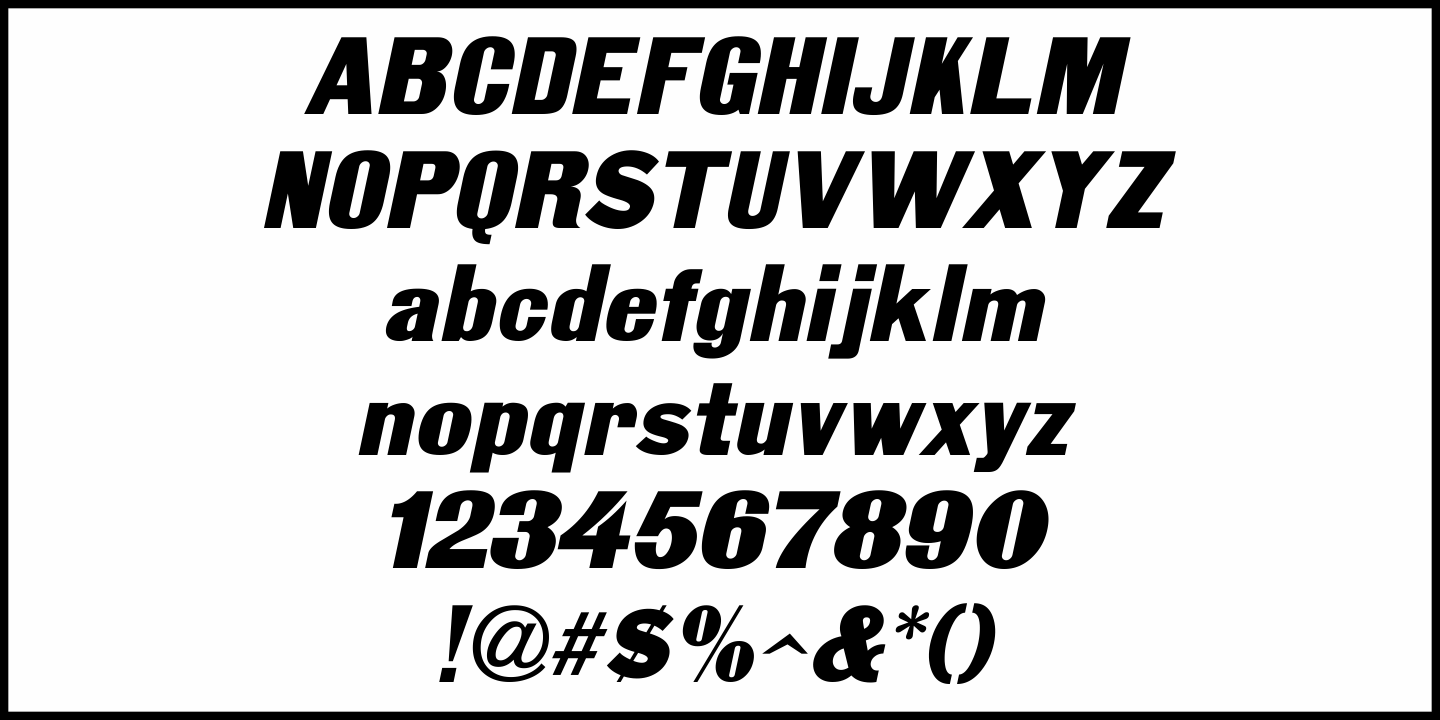
One familiar characteristic of early grotesk fonts (such as this one) is the numerous variations of character widths and shapes.
By combining those two terms into a font name, the digital version of this design is called Gothic Grotesk JNL, and is available in both regular and oblique versions.
Get It Now from Font Bros