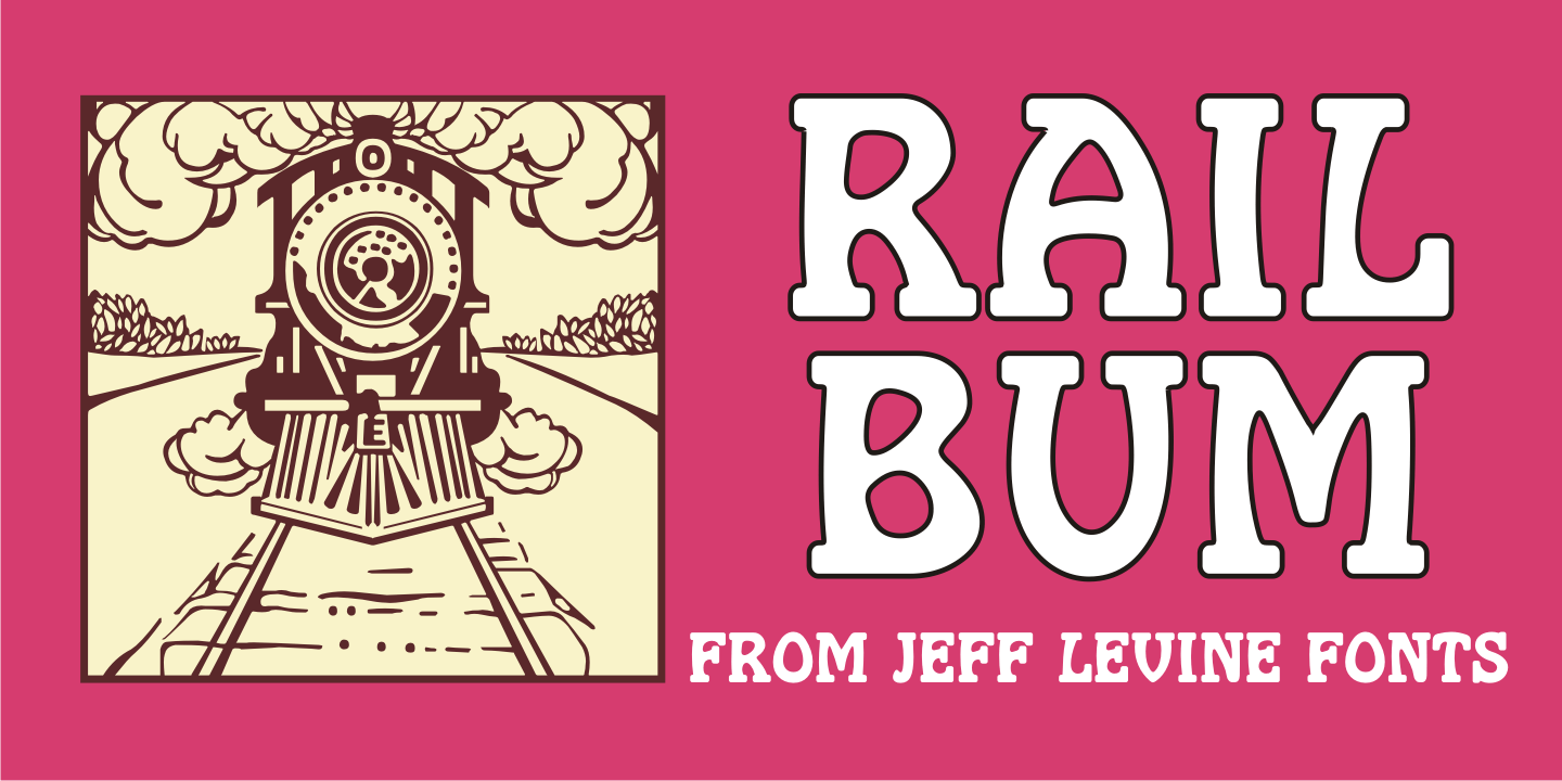
Rail Bum Poster Gallery Rail Bum Thumbnail #1 Rail Bum Thumbnail #2 Rail Bum Thumbnail #3 Rail Bum Thumbnail #4

Rail Bum

From $29  |  1 Font Family by Jeff Levine Fonts

Morris Fuller Benton's Hobo [designed in 1910] is one of a number of fonts which have been so over-used that many designers shy away from it altogether.

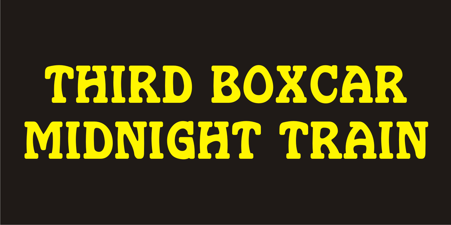
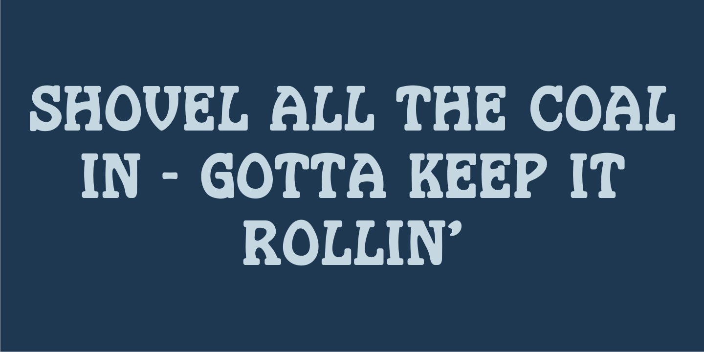
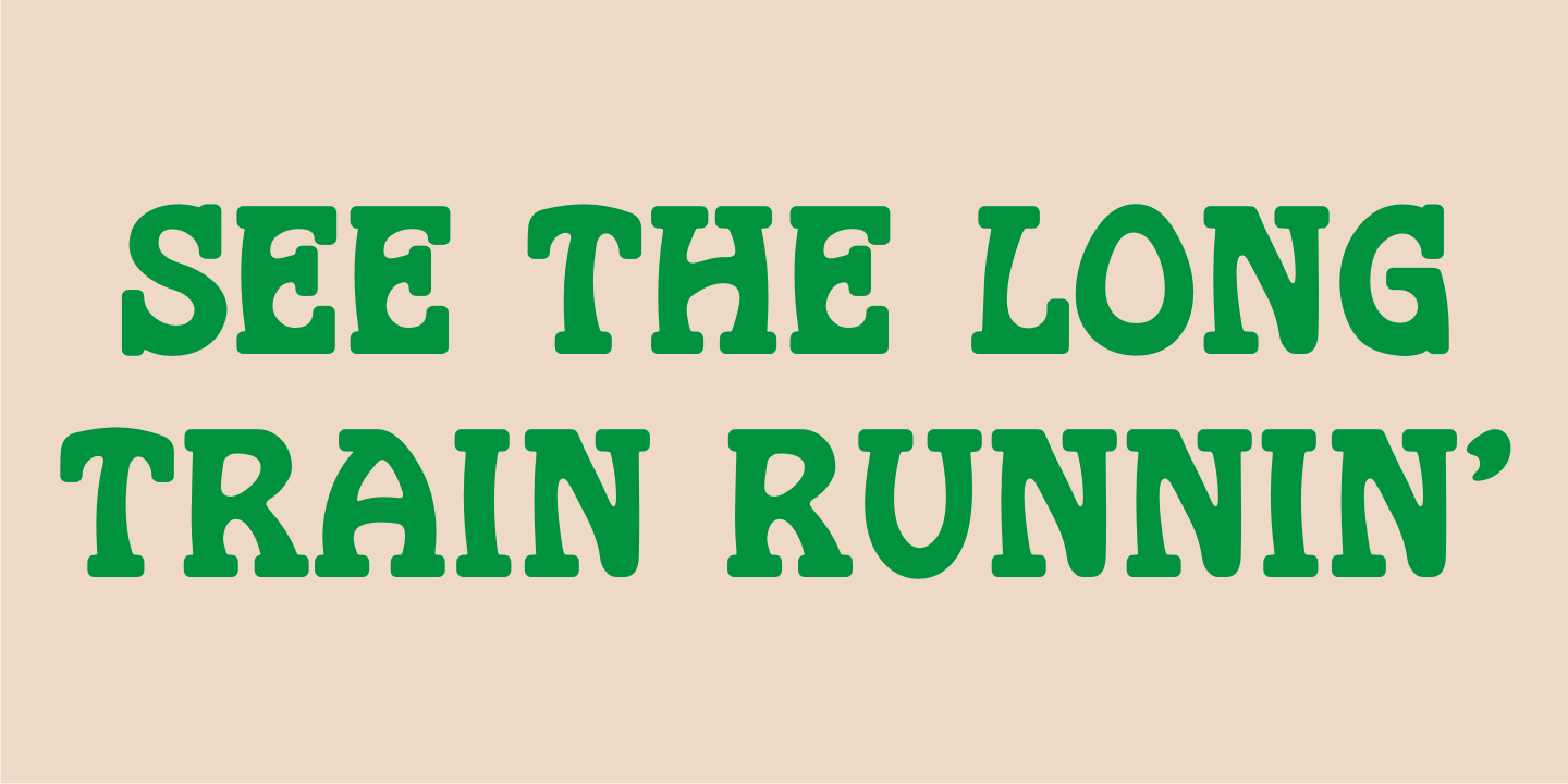
However, Jeff Levine had often wondered what the design might look like it given a serif treatment. The result is Rail Bum JNL, named for the hobos and transients who hitched along on freight cars to ride the rails across the country during the years when trains were the mainstay of American transportation.

Get It Now from Font Bros

Test Drive This Font

Font Style

Font Size60px

Type Your Text Here

Get It Now from Font BrosView More Fonts

Character Map

Rail Bum includes 213 glyphs.


Rail Bum JNL Regular by Jeff Levine Fonts

Character Map (213 Glyphs)

!"#$%&'()*+,-./0123456789:;<=>?@ABCDEFGHIJKLMNOPQRSTUVWXYZ[\]^_`abcdefghijklmnopqrstuvwxyz{}~¡¢£¤¥¨©ª«­®²³´·¸¹º»¼½¾¿ÀÁÂÃÄÅÆÇÈÉÊËÌÍÎÏÐÑÒÓÔÕÖרÙÚÛÜÝÞßàáâãäåæçèéêëìíîïðñòóôõö÷øùúûüýþÿŁłŒœŠšŸŽžˆˇ˙˚˜

Related Fonts