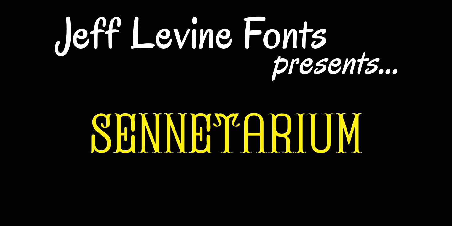


Sennetarium
From $29 | 1 Font Family by Jeff Levine Fonts
Jeff Levine first designed Sennetarium JNL back in 2004; based on the large drop caps found on intertitle cards from an old Charlie Chaplin film. The font's name is a nod to Mack Sennett, king of the screwball comedies of the silent film era.
At one point Jeff gave the design to Ray Larabie as a companion to Ray's Typodermic release, Silentina. Still, nothing came of it until 2008 when Ray offered Jeff the chance to retrieve the design, finalize it and release it. Good things are worth waiting for.
Get It Now from Font Bros