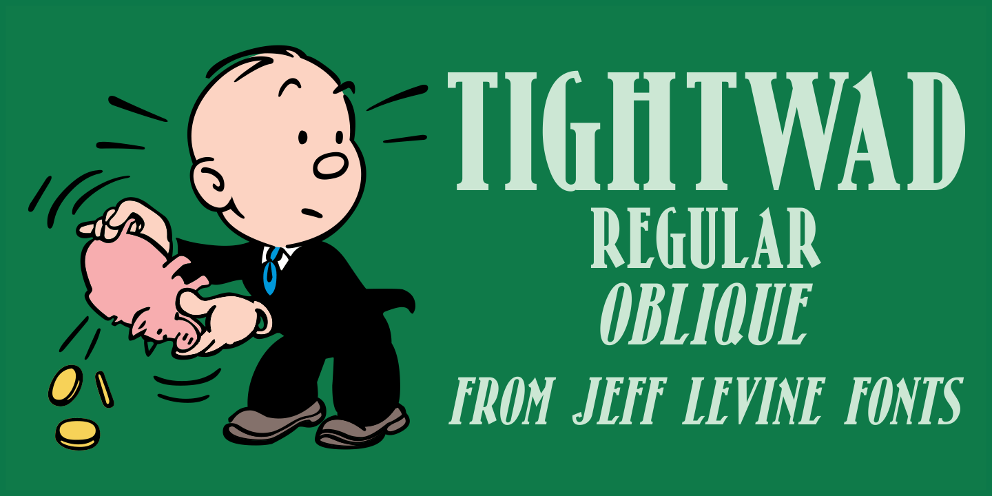
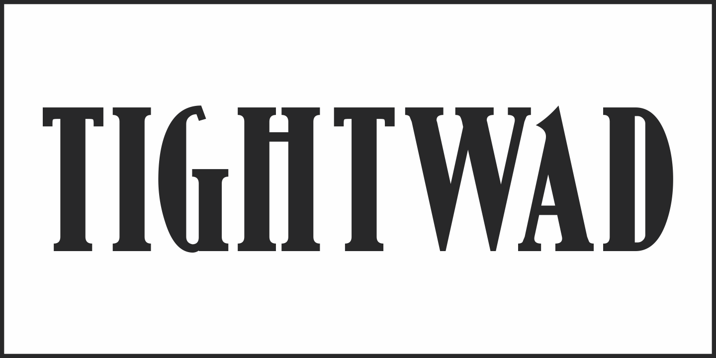
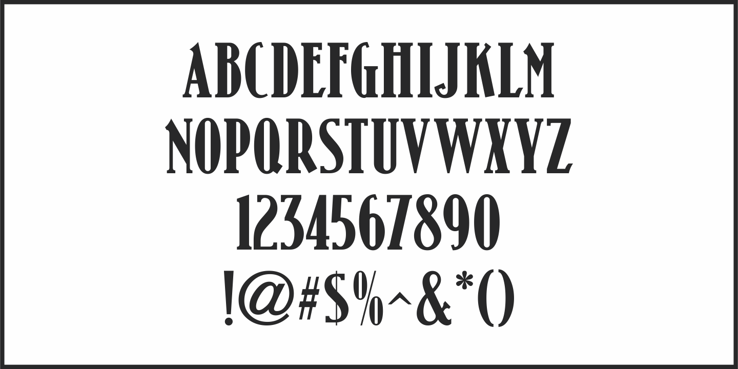
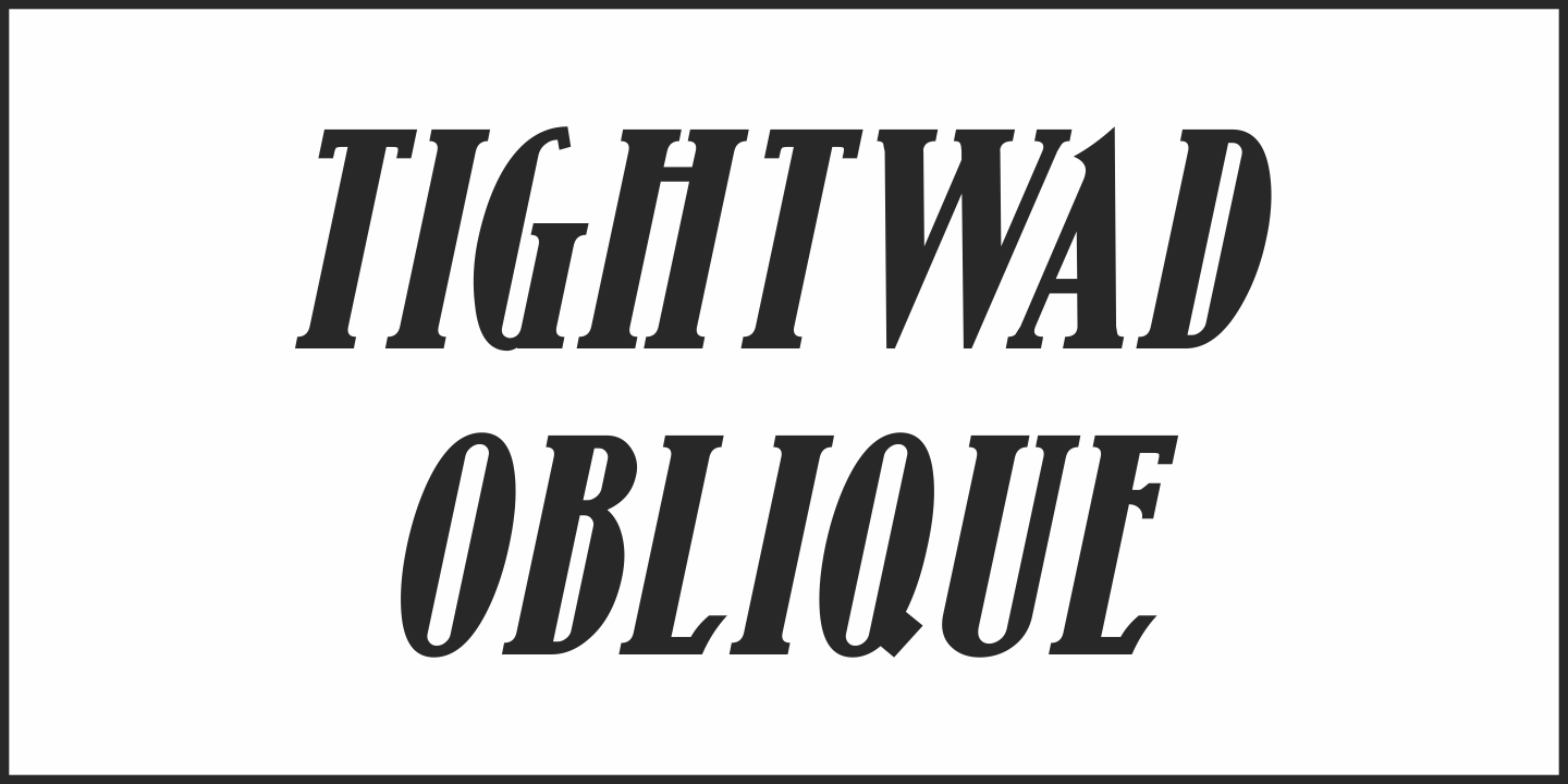
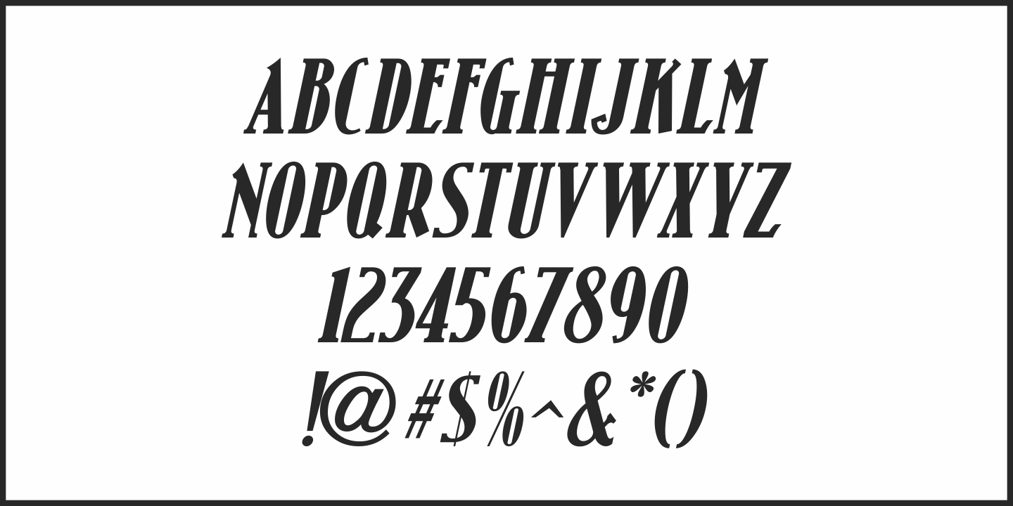
Tightwad Poster Gallery Tightwad Thumbnail #1 Tightwad Thumbnail #2 Tightwad Thumbnail #3 Tightwad Thumbnail #4 Tightwad Thumbnail #5

Tightwad

From $55  |  2 Font Family by Jeff Levine Fonts

“I Don't like No Cheap Man” is a piece of early 1900s sheet music featuring its title hand lettered in a condensed slab serif design.

The influences of the Art Nouveau era are clearly found in the many eccentric character shapes within the various letters of the original artwork.

Recreated in digital type, Tightwad JNL is available in both regular and oblique versions – and its font name is a variant of the “Cheap Man” portion of the song’s title.

Get It Now from Font Bros

Test Drive This Font

Font Style

Font Size60px

Type Your Text Here

Get It Now from Font BrosView More Fonts

2 Styles Included

Oblique

Regular

Character Map

Tightwad includes 213 glyphs.


Tightwad JNL Regular by Jeff Levine Fonts

Character Map (213 Glyphs)

!"#$%&'()*+,-./0123456789:;<=>?@ABCDEFGHIJKLMNOPQRSTUVWXYZ[\]^_`abcdefghijklmnopqrstuvwxyz{}~¡¢£¤¥¨©ª«­®²³´·¸¹º»¼½¾¿ÀÁÂÃÄÅÆÇÈÉÊËÌÍÎÏÐÑÒÓÔÕÖרÙÚÛÜÝÞßàáâãäåæçèéêëìíîïðñòóôõö÷øùúûüýþÿŁłŒœŠšŸŽžˆˇ˙˚˜

Related Fonts