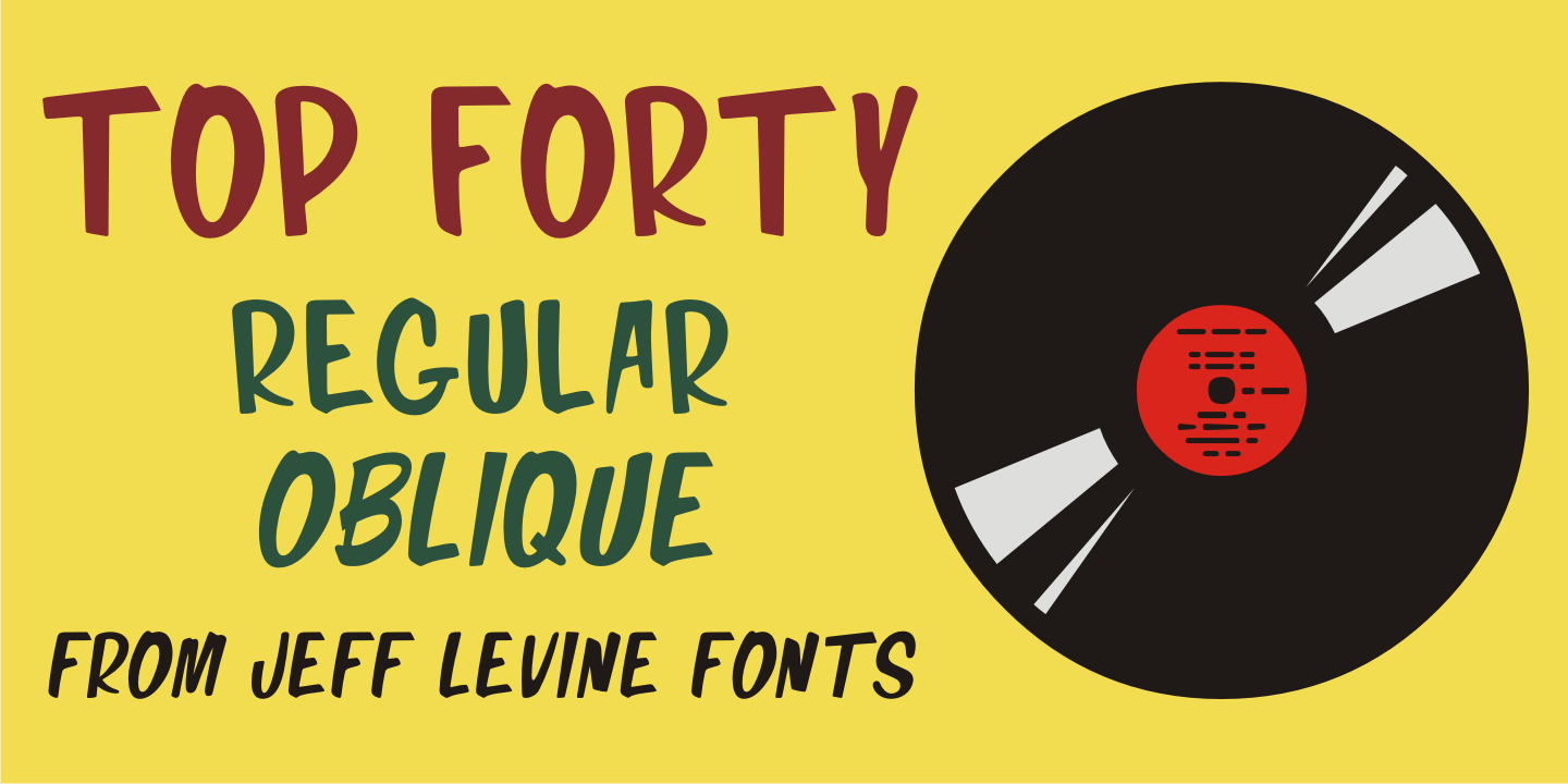
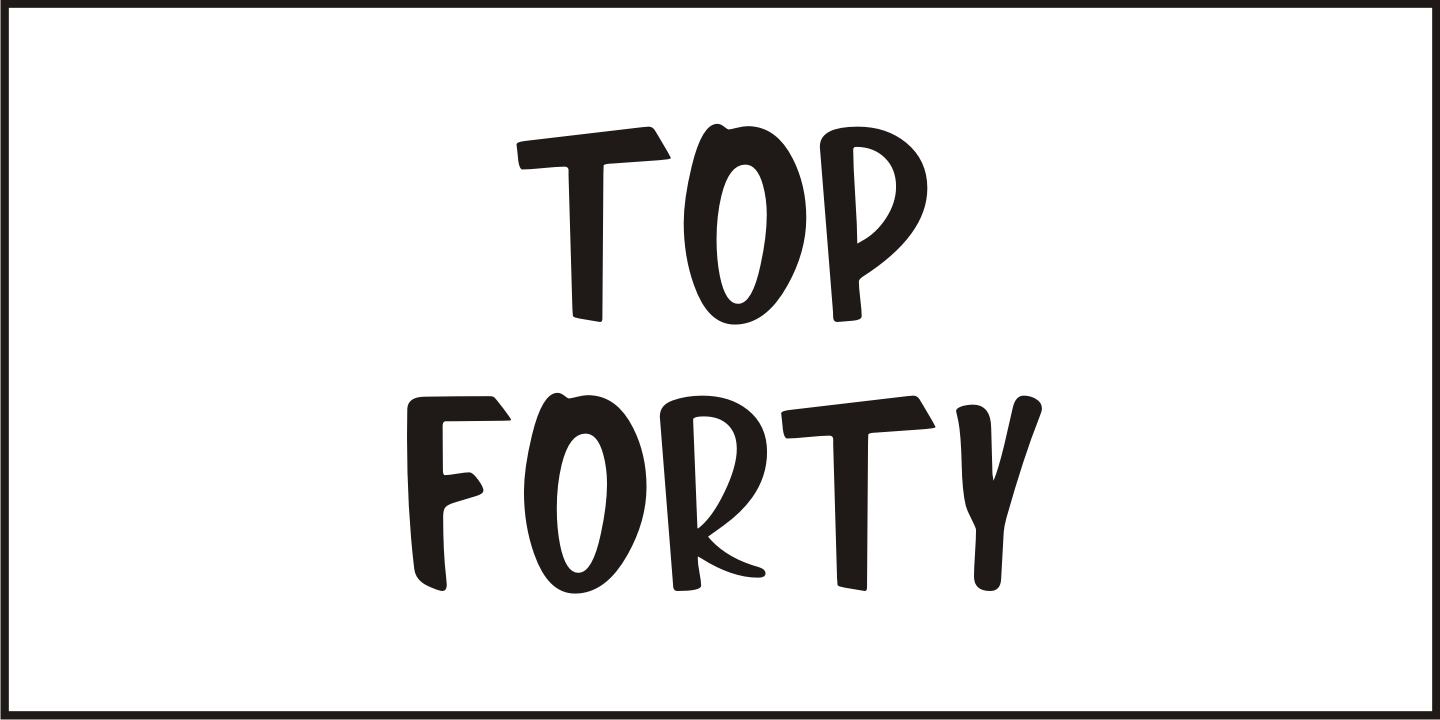
Top Forty Poster Gallery Top Forty Thumbnail #1 Top Forty Thumbnail #2 Top Forty Thumbnail #3 Top Forty Thumbnail #4 Top Forty Thumbnail #5

Top Forty

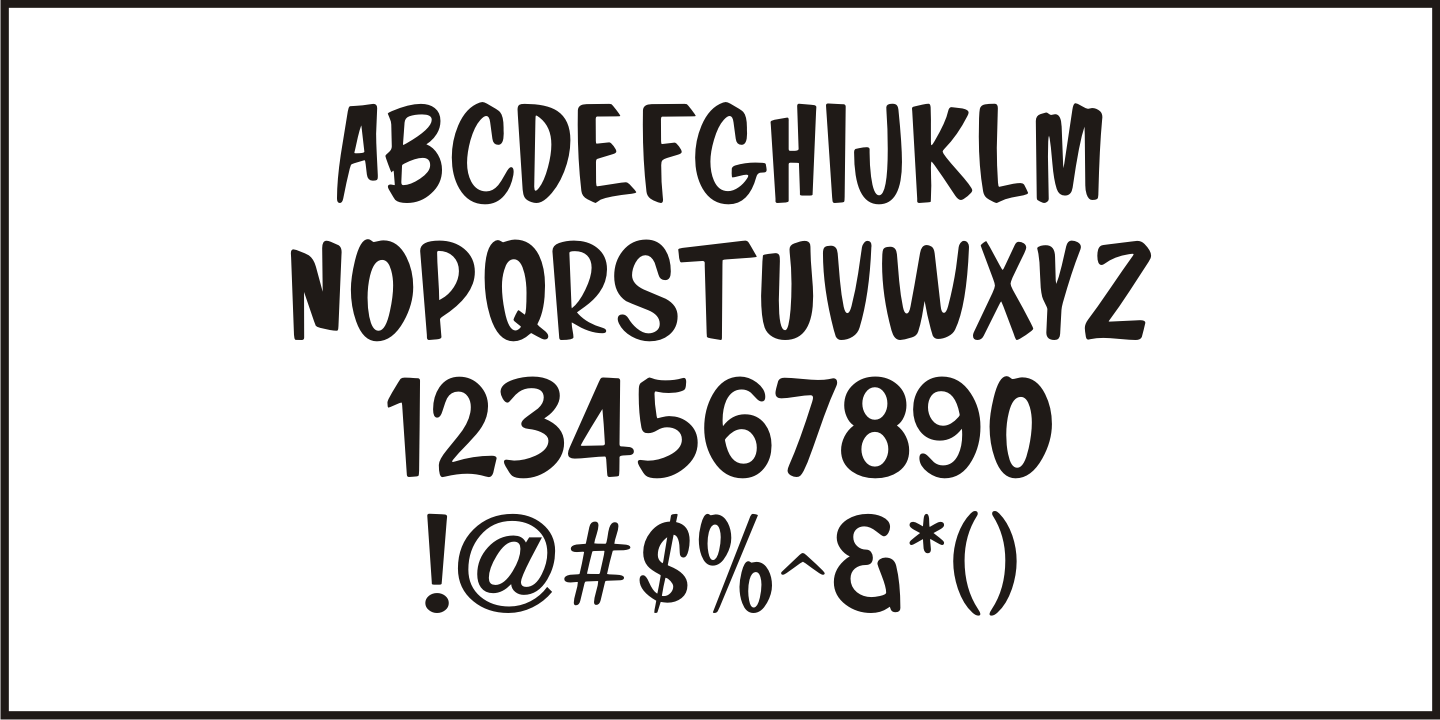
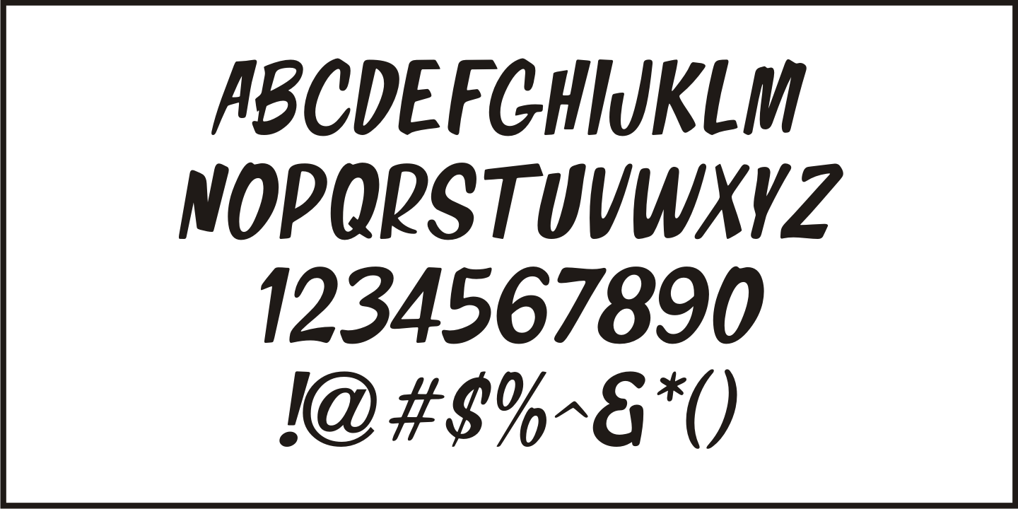
From $55  |  2 Font Family by Jeff Levine Fonts

A 1963 issue of Billboard Magazine contained an ad for Jimmy Smith (along with some other artists on the same record label) that was hand-lettered in a free-form style similar to show-card 'one-stroke' typographic design.

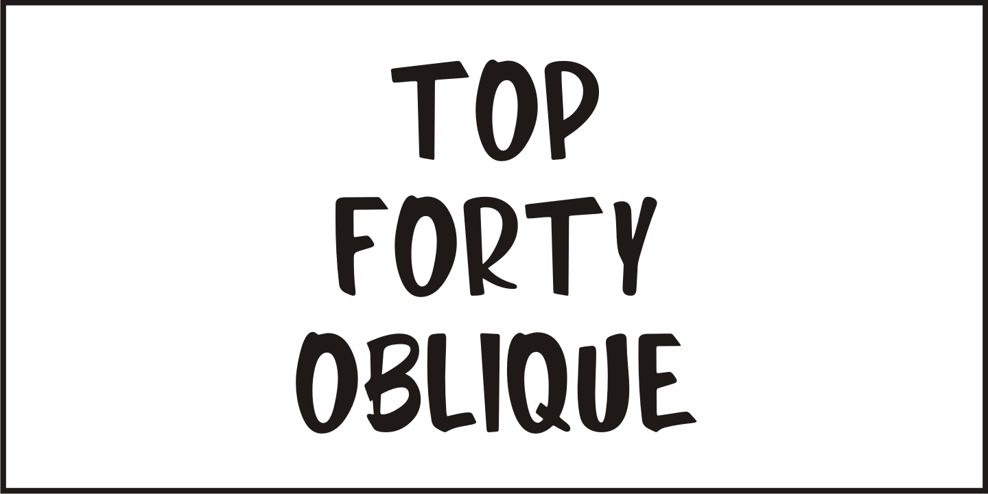
This was the inspiration for Top Forty JNL, which is available in both regular and oblique versions.

Get It Now from Font Bros

Test Drive This Font

Font Style

Font Size60px

Type Your Text Here

Get It Now from Font BrosView More Fonts

2 Styles Included

Regular

Oblique

Character Map

Top Forty includes 213 glyphs.


Top Forty JNL Regular by Jeff Levine Fonts

Character Map (213 Glyphs)

!"#$%&'()*+,-./0123456789:;<=>?@ABCDEFGHIJKLMNOPQRSTUVWXYZ[\]^_`abcdefghijklmnopqrstuvwxyz{}~¡¢£¤¥¨©ª«­®²³´·¸¹º»¼½¾¿ÀÁÂÃÄÅÆÇÈÉÊËÌÍÎÏÐÑÒÓÔÕÖרÙÚÛÜÝÞßàáâãäåæçèéêëìíîïðñòóôõö÷øùúûüýþÿŁłŒœŠšŸŽžˆˇ˙˚˜

Related Fonts