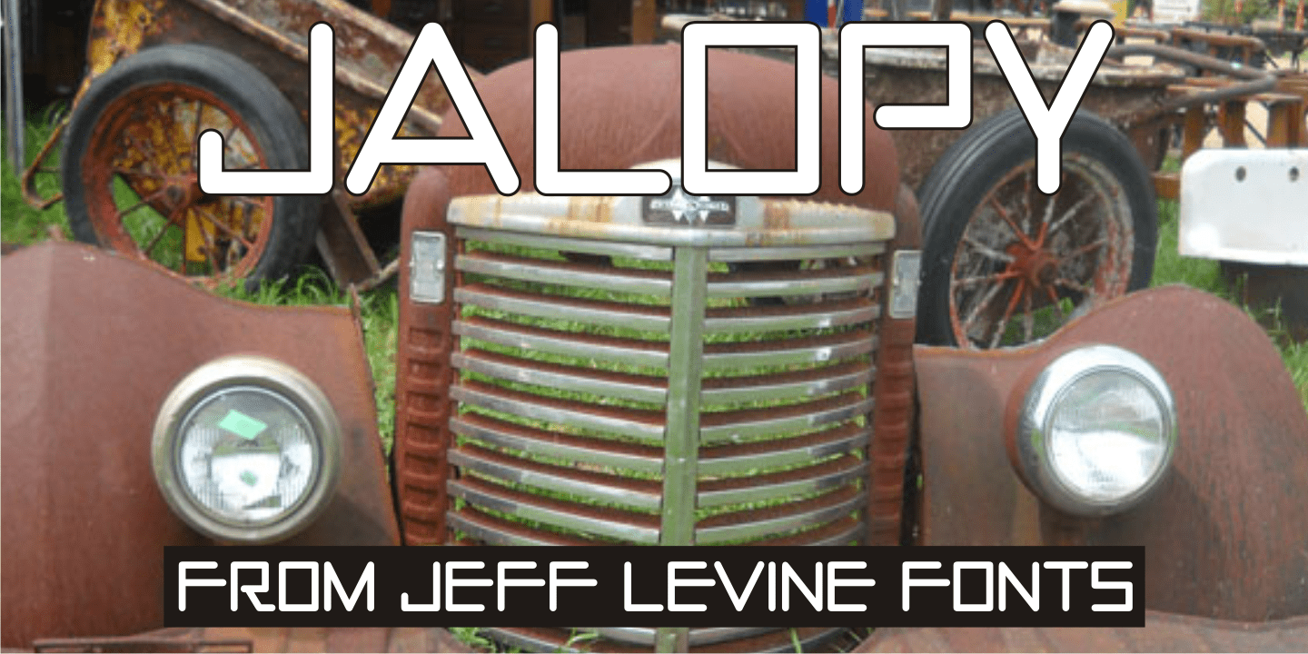


Jalopy
From $29 | 1 Font Family by Jeff Levine Fonts
History, as it's said, tends to repeat itself. The round-point pen lettering used in the 1920s logo and ads for Dodge Brothers cars (pre-General Motors) is an early predecessor to the techno type styles of the 1980s.
Square in shape, with unique stylization to some letters, Jalopy JNL can cross the decades and be used for a 1920s period piece and still look fresh in an ad for computer parts.
Rather than round out the inside lines of the characters to fully emulate the strokes of a lettering pen, the inside lines have straight intersections for the contemporary side of this font's design.
Get It Now from Font Bros